.jpg)
Building a digital brand that stands out in the AI era means treating brand strategy as the first step, not the last: understand your audience and market, decide what you stand for in one sentence, design a system rather than a single logo, show up consistently across every touchpoint, and protect the brand as you grow. AI can execute each of those steps faster, but it can't make the positioning decisions that make a brand recognizable instead of interchangeable.
Last month I opened three landing pages in a row. Different products, different founders, different countries. Same purple gradient, same "effortless, AI-powered" headline, same rounded sans-serif. An hour later, I couldn't have told you which was which, and evaluating brands is a large part of my job.
That moment describes where we are. Launching a digital product has never been easier. With AI, anyone can ship an app, a course, a SaaS tool, or an online store in weeks. Sometimes days. That sounds like good news until you consider what it means for the business: when everyone can build, building stops being what sets you apart. The differentiation moves somewhere else.
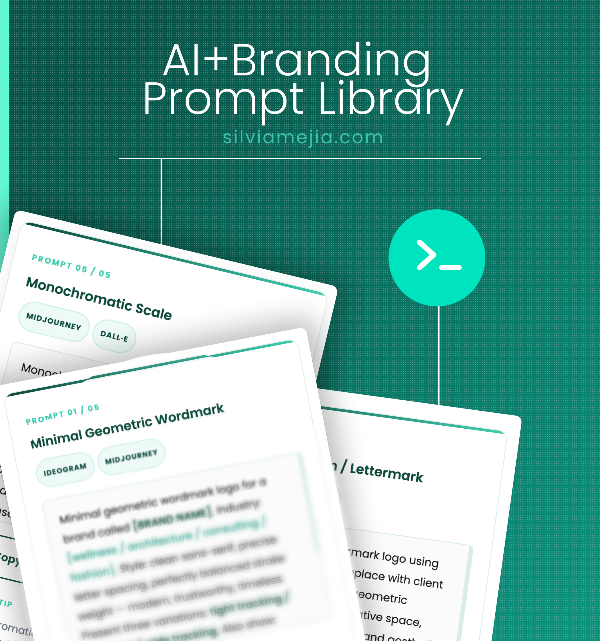
I've spent over 15 years helping organizations build and manage brands, across healthcare, energy, and consumer industries, aligning strategy, identity systems, and customer experience. And I should be honest: I'm going through this exact process myself. Alongside client work, I've started building my own digital products, small experiments like a branding prompt library and a brand toolkit that I made because I thought they might be useful to someone. Nothing polished, nothing perfect. But each one has to connect back to my own personal brand, which means I'm making the same decisions I'm about to describe, in real time, with all the same doubts. What that experience keeps confirming: the product is the easy part now. Making it recognizably yours, and making that recognition translate into trust, is the work.
So my conclusion is a business one, not an aesthetic one. In the AI era, your brand is the last real competitive advantage, because it's the one asset nobody can generate in an afternoon.
Here's how I believe a digital brand should be built. One that people remember, trust, and ultimately buy from. Five stages, in order. The order matters! I'll explain why at the end.

1. Understand before you create
AI compressed production time. It didn't compress understanding, and understanding is where brands are actually born.
Before anyone touches a design tool, get clear on three things: your business (why you exist beyond making money), your audience, and your market.
The audience question is where I think you should push the hardest, and where many push back most. "Women 25 to 45 interested in wellness" is not an audience. It's a demographic, a box on a form. An audience sounds more like "first-time founders who know their product is good but feel a little embarrassed sending people to their website." One of those you can position against. The other you can't.
This applies just as much when the product is your own. When I built my first tools, the temptation was to make them for "designers and founders," which is everyone and therefore no one. They only started to make sense when I asked a narrower question: who is already reading my work, and what do they get stuck on? I'm still adjusting the answer, honestly. But asking it changed what I built. When ten new products appear in your category every week, specificity is what makes someone feel a brand was made for them. And that feeling has a commercial consequence: people don't comparison-shop brands they feel understood by.
Then study your five closest competitors. Really look: their positioning, their tone, their promises, and yes, their visuals. Not to copy them, but to find the space they left empty. Right now that space is bigger than it's ever been, because so many products are shipping with the same defaults.
2. Decide what you stand for, in one sentence
This is the step most digital brands skip, and it's the reason so many feel interchangeable. I've seen many people who arrive with a finished logo and no answer to the most basic question: why you, and not the competitor one search away?
Write that answer in one sentence. It becomes the brief for every decision that follows, visual and otherwise. A brand promising effortless simplicity and a brand promising maximum performance should not look alike, sound alike, or price alike. Different promise, different typography, different color, different rhythm. When two brands with different promises look the same, it's usually because nobody made a positioning decision, and the design defaults filled the vacuum.
I use AI daily in my own workflows, so this observation doesn't come from a skeptic: AI branding tools produce averages. That's not a criticism; it's how they work. They return what usually works, which is another way of saying what everyone already has. Positioning is where you choose to be un-average, and no tool makes that choice for you. It's a business decision, and it's still yours.
3. Design a system, not a logo
Now the visual part. Notice it's step three, not step one. Design executes the strategy; it doesn't replace it.
Your visual identity is everything you just decided, made tangible. For a digital brand, it can't be a logo floating alone on a brand board. It has to be a visual identity system: a logo that works from favicon to billboard, one or two primary colors with a few supporting ones, a type hierarchy that survives a phone screen, a defined photography style, consistent icons. Past five colors, recognition starts to dilute. I've watched it happen on real projects. Increasingly, the system also includes motion, because how your brand behaves on screen is part of its identity whether you planned for it or not.
Why a system and not just good-looking assets? Because a system is an operational tool. It makes every future decision cheaper and faster, for you, for your first hire, for the AI workflows you'll eventually plug in. A logo is an expense. A system is infrastructure.
There's one test I run on every identity I work on. Remove the logo. If people still recognize the brand from color, type, and image style alone, you have an identity. If not, you have a logo. That recognition isn't a vanity metric: a brand people recognize doesn't pay to be reintroduced every time it shows up.
4. Show up consistently at every touchpoint
Nobody experiences your brand in a style guide. They experience it touchpoint by touchpoint: your website, your Instagram, your onboarding emails, your checkout page, your invoices. Yes, your invoices. Every point of contact is either building recognition or quietly eroding it, and erosion has a cost you never see on a dashboard.
A useful exercise: list every brand touchpoint your audience will meet in their first month of knowing you, and make those ruthlessly consistent. Same palette, same type, same voice, same image treatment. A brand seen 50 times looking identical builds more recognition than one seen 200 times looking slightly different. That's a better return on the same content budget. "Slightly different" feels harmless. It isn't, and it compounds faster than you'd expect.
This is also where AI earns its place in the operation. Once your system is solid, AI tools let you produce consistent content at a speed that wasn't possible a few years ago. I run my own content and product work through AI workflows built on top of my brand system, and the pattern is reliable: AI amplifies whatever you feed it. Feed it coherence and you get coherence at scale. Feed it chaos and you get more chaos, faster, at a volume that makes the incoherence very public.
5. Protect the brand as you grow
Launch isn't the finish line. It's the start of brand management, the least glamorous stage and the one that determines whether everything above holds together.
Document your digital brand identity, even if it's one page: exact color codes, fonts and hierarchy, logo rules, a few image references. It sounds bureaucratic for a small brand. It isn't. It's governance, and it's what keeps you coherent when you hire your first collaborator, plug your brand into an AI content workflow, or publish a promo post at 11 p.m. The 11 p.m. post is rarely on brand unless the rules are written down somewhere.
Consistency compounds like interest. Guidelines are how you protect the investment, and they cost a fraction of the redesign you'll otherwise be paying for later.
AI builds products. It doesn't build brands.
The AI era didn't make branding less important. It made it the deciding factor. When anyone can ship a product, the questions that determine who wins are brand questions: who do you serve, what do you stand for, and are you recognizable everywhere you show up?
Build in this order: understanding, strategy, system, touchpoints, stewardship. Every decision downstream gets easier and cheaper. Skip ahead to the visuals, tempting as that is, and you'll likely be redesigning within a year. I've been the person hired to do that redesign more times than I can count, and it always costs more than doing it in order would have.
Two ways I can help from here. If you want to work through positioning and identity on your own.
I've made a couple of tools while going through this process myself. They started as experiments for my own work; if they're useful to yours, even better:
Silvia Mejia is a Design Strategy Leader with 15+ years of experience in brand systems, UX/UI, and product design. She has worked with healthcare, energy, B2B industrial, and consumer brands, and creates practical resources for designers who want to work with more clarity and intention.
.png)
Related Content